Chloe Tempco | Web Design for Fitness Studios

Chloe Tempco | Web Design for Fitness Studios

Websites for fitness studios that make them proud to share their link!
4.9
(8)

19
項專案已完成

服務
網域連結進階網站設計網站指導
網域連結進階網站設計

認證
無障礙
無障礙
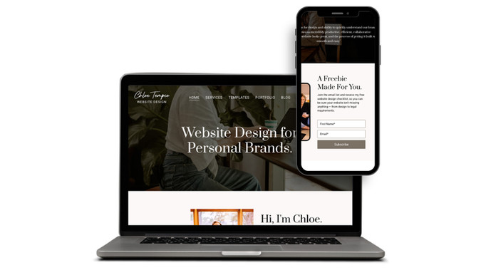
Chloe Tempco Website Design: My own Wix-built website, designed to showcase my web design work and generate leads. The homepage leads with a bold headline, trust badges (Wix, Squarespace, Google, Upwork), and client testimonials. A clear funnel drives visitors from a free email opt-in checklist through tiered pricing packages ($999–$4,999+) to a project inquiry form — all wrapped in warm photography and a personal "Hi, I'm Chloe" bio.
Chloe Tempco Website Design
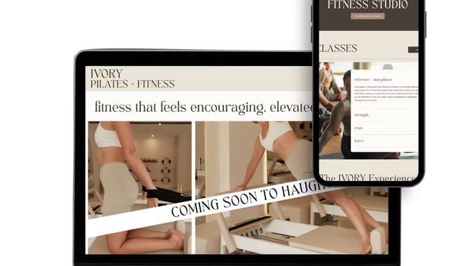
Ivory Pilates: Client: Ivory Pilates + Fitness — boutique Pilates & fitness studio (Haughton, LA)
Role: Full design + build (redesign)
Platform: Wix
Deliverables: Redesigned site — homepage, class schedule, membership/packages page, about, gift cards, email capture

The Brief
Ivory Pilates + Fitness was pre-launch — no grand opening date locked in yet, no active membership base — but needed a site that could start building buzz and capturing interest immediately. The redesign had to do something tricky: sell a feeling and a future experience before there was a physical class to point to, while giving the brand a polished, credible presence from day one instead of feeling like a placeholder "coming soon" page.

The Process
Since there was no track record yet to lean on, the redesign leaned entirely on brand feel and anticipation-building, rather than social proof or class photos of a packed studio:
- Tone as the selling point — "fitness that feels encouraging, elevated, and approachable" is stated directly and repeated, doing the work of a mission statement and a value prop at once, since there's no client base yet to prove it
- Email list as the primary conversion goal — front and center on the homepage, framed around exclusivity and urgency ("be the first to know about founding memberships... an upcoming grand opening date"), which is the right CTA for a pre-launch business — you're not selling a class yet, you're selling a place in line
- A clear class taxonomy from day one — Reformer + Mat Pilates, Strength, Yoga, Barre are laid out even before a full schedule exists, so visitors immediately understand what kind of studio this is and can picture themselves there
- Local + boutique positioning — "Haughton's local, boutique styled fitness studio" plants a flag in a specific community rather than reading as generic fitness-brand copy
- Personal, values-driven closing note — the founder's scripture reference in the footer signals the kind of studio and community this is meant to be, which matters for word-of-mouth buzz in a small town before the doors even open
Ivory Pilates
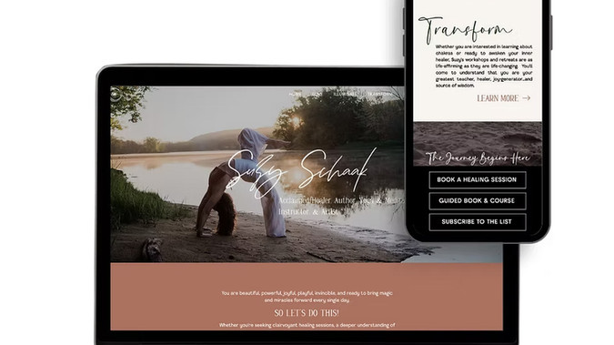
Suzy Schaak: Client: Suzy Schaak — healer, author, yoga & meditation instructor, and artist
Role: Full design + build
Platform: Wix
Deliverables: Full site — home, healing sessions, book/workbook, courses, workshops/retreats, blog, contact/scheduler

The Brief
The redesign needed to bring together healing sessions, a published book and workbook, guided courses, workshops, retreats, and healing art — all under one very personal brand — in a way that felt cohesive and reflected who Suzy actually is, rather than reading as a scattered list of services.

The Process
This is a personal-brand site built around one person doing many things, so the core design challenge was organizing range without diluting identity. A few decisions worth calling out:
- Three clear pillars instead of a flat service list — Love (healing sessions), Illuminate (book/courses/blog), and Transform (workshops/retreats) group a wide range of offerings into three intuitive, emotionally-named categories rather than a generic dropdown menu
- Testimonial placed immediately, not buried — a powerful, specific story (a husband describing Suzy's help through his wife's terminal illness) appears right on the homepage, doing more to build trust in a healing/spiritual practice than any bio copy could
- Voice-first homepage copy — direct, personal language ("You are beautiful, powerful, joyful..." / "SO LET'S DO THIS!") makes the brand feel like it's actually Suzy speaking, which matters enormously for a healer/personal-brand business built on individual connection
- Multiple entry points for different commitment levels — Book a Healing Session (high-touch, 1:1), Guided Book & Course (self-paced, lower commitment), Subscribe to the List (no-commitment) — meeting visitors wherever they are in their trust/readiness journey
- Cohesive visual identity across very different content types — a book, a course, retreats, and 1:1 sessions all live under one consistent look, so the site reads as one unified brand rather than four separate offers stitched together
Suzy Schaak
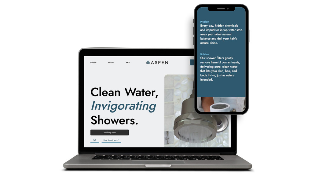
Aspen Clean Co.: A Wix-built landing page I designed and built for Aspen Clean Co., a filtered showerhead brand focused on skin and hair wellness. The page follows a single-product, direct-to-Amazon sales funnel: a bold "Clean Water, Gentle Showers" hero with a Shop Now CTA leads into a problem/solution section backed by hard-hitting stats (85% of the U.S. has hard water, 98% is chlorine-treated), a technical breakdown of the 10-stage A1 filter, customer testimonials, an FAQ accordion, and a simple 3-step "no handyman needed" install guide — all designed to drive purchases through Amazon.
Aspen Clean Co.
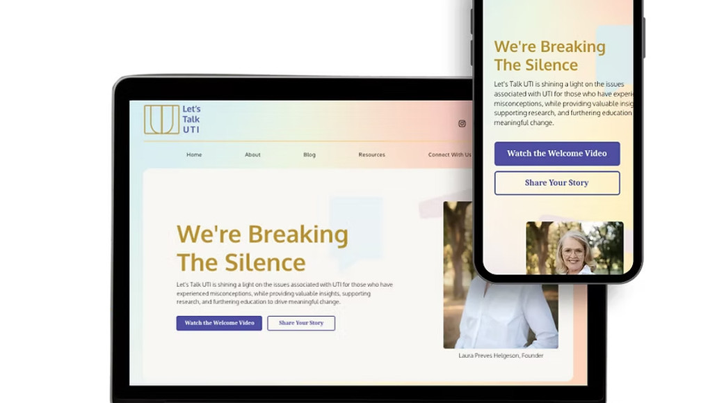
Let's Talk UTI: Client: Let's Talk UTI — patient advocacy nonprofit/resource for UTI awareness
Role: Full design + build (new site from scratch)
Platform: Wix
Deliverables: New site — homepage, blog, resource library, support groups directory, newsletter/podcast hub, donation page, e-book/product page

The Brief
Let's Talk UTI needed a digital home to raise awareness for a condition that's chronically under-discussed, underfunded, and under-researched — and to give visitors going through it somewhere to turn. The site had two jobs at once: build credibility for a new advocacy voice, and act as a genuine resource hub so someone in pain, mid-flare-up, could quickly find something useful.

The Process
Because this is an awareness and resource site (not a product sale), the design challenge was less about conversion funnels and more about emotional tone + navigability under stress. A few decisions that stand out:
- "Breaking the Silence" as the emotional anchor — the homepage leads with a mission statement, not a service list, positioning the brand as a movement rather than a business
- Resources organized by need, not by category for category's sake — Newsletters, Podcasts, Downloadable Resources, Testing Choices, UTI News, Client Stories, and Support Groups are all separated into their own destinations, so a visitor in distress doesn't have to dig through a generic "blog" to find what actually helps them right now
- A low-friction way to feel less alone — "Share Your Story" and "Client Stories" give the community a visible presence on the site itself, not just on social
- Dual CTA strategy — "Donate" lives permanently in the header (sustaining the mission), while "Share Your Story" and "Download Library" are the emotional, visitor-facing CTAs woven through the homepage — separating funding the cause from getting help, so neither competes with the other
- A founder, not just a brand — "Meet Laura" and "The Founder's Story" give the advocacy work a human face, which matters enormously in health spaces where trust is the entire currency
Let's Talk UTI
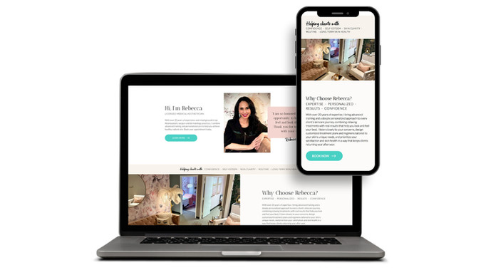
Fresh Faces by Rebecca: A Wix-built website I designed and built for Fresh Faces by Rebecca, a medical aesthetician's skincare studio in Atlanta offering dermaplaning, microneedling, chemical peels, hydrodermabrasion, and LED therapy. The homepage opens with a "Where Results Meet Relaxation" hero, then introduces Rebecca with her 20+ years of experience and background in top Atlanta plastic surgery and dermatology practices. A six-service grid leads into a scrolling testimonial carousel and an extensive before-and-after gallery that showcases real client results, followed by SEO-driven blog content, an email opt-in, and a persistent "Book Now" CTA throughout.
Fresh Faces by Rebecca
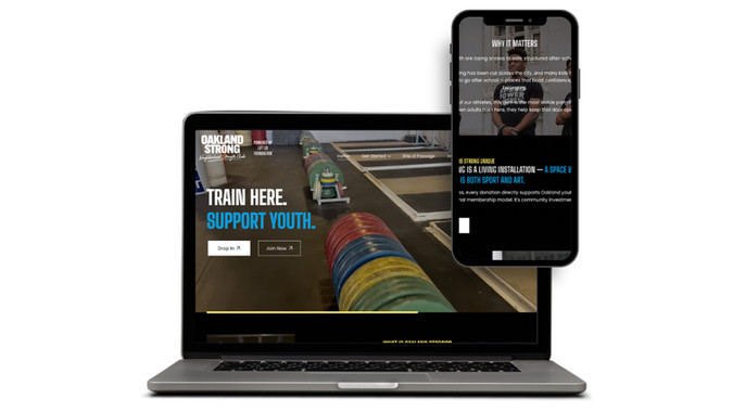
Oakland Strong: A Wix-built nonprofit website I designed and built for Oakland Strong, an Olympic weightlifting community gym in Oakland where adult memberships fund free strength training for local youth athletes. The homepage opens with a bold "Train Here. Support Youth." hero and dual Drop In/Join Now CTAs, then walks visitors through the model — adults train, youth train free — backed by striking action photography and standout impact stats (10k+ mentoring hours, 1,500+ youth impacted, 100% high school graduation and college acceptance). A "Strongest Kids in Oakland" gallery spotlights national and international youth champions, and the site closes with donation, contact, and Lift Us Foundation nonprofit info.
Oakland Strong
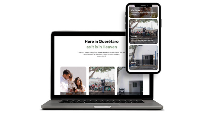
Plants and Pillars Church: A bilingual Wix website I designed and built for Plants and Pillars Church, a Bible-centered congregation in Querétaro, Mexico, offering English and Spanish services. The homepage opens with a scripture-anchored welcome (Psalm 144:12) and a "Here in Querétaro as it is in Heaven" theme, then guides visitors through three core sections — Who We Are, Podcast, and Visit Us — before unpacking the church's core convictions (the Word of God, the Presence of God, the Ways of God) alongside worship photography. An embedded Instagram feed keeps the site current with weekly teachings and events, and clear service times, contact info, and a "Give" CTA are anchored throughout the layout.
Plants and Pillars Church

關於
A patchwork website can cost you more than time—it can cost you trust, clients and revenue while keeping you stuck in the cycle of fixing instead of growing. I design polished, cohesive websites for fitness studios that make it easier for clients to say yes, simplify your client experience, and give you the confidence to finally feel like you've got it together.... 
IL, US
English
平台:Wix & Wix Studio
無障礙 (2024)

服務

網頁設計 (5)

小任務 (5)

行銷和推廣 (3)

平面設計 (2)

一般網站設計

取得包含主題的基本網站。
從 $2,999 起

進階網站設計

取得具備自訂視覺效果、進階功能等的網站。
從 $4,999 起

重新設計網站

為網站取得新主題與設計。
從 $2,999 起

遷移網站

在新的 Wix 網站上使用現有的圖像與內容。
從 $2,999 起

行動版網站

讓網站在行動裝置上完美呈現。
從 $100 起

評價
4.9(8)
5

2023年6月10日
Chloe is fantastic - she is the first person I've worked with who has actuallu done what I requested. I'm a surface designer and can't be slotted into a general category. She understands completely my very specific needs. I look forward to doing a lot of work with her in the future.... 
提供的服務:網站更新
5

2023年2月27日
Chloe is amazing! Super clear, efficient and enthusiastic I will have to wait and see how the SEO work plays out its a bit too soon to tell at the moment. I highly recommend Chloe!... 
提供的服務:SEO 服務
5

2023年1月26日
Had a basic request to clean up mobile site tables and orientation. Chloe did that and also spent time on other pieces she came across. liked the proof of performance approach she used as well. Thanks Chloe, Jim... 
提供的服務:網站更新
5

2022年2月17日
Very helpful, skilled and quick service to debug my website, thanks a lot Chloe! I can recommend and would work again together. fair pricing... 
提供的服務:網站更新
4

2022年2月14日
Very helpful and did a good job, I like how she layed out exactly what to expect in the youtube video before hand.... 
提供的服務:網站更新
5

2022年1月14日
Polite, professional, and capable. Responsive, insightful, and provides good ideas for improvement. Open to questions and patient. Explains things clearly. She was careful to respond to each list of questions in the order they were asked. Most importantly, Chloe is a nice person to work with. I will ask for her help in the future. Doug S.... 
提供的服務:網站更新